
by Nanna Inie, researcher and practitioner in Digital Design at Aarhus University.
PRESENTING YOUR ACADEMIC WORK AT A CONFERENCE – applicable tips and advice
Everybody likes a good conference presentation. It is your chance to catch the interest of a room of interested peers that might cite your work and help spread it for you. Whether you are presenting a talk or a poster, you have the opportunity to sprout the interest of those conference attendees that just accidentally happened to be there because you were co-located with a talk or poster they actually came to see.
Perhaps even more importantly, you also take upon yourself the risk of boring the living hell out of those attendees that chose to give you just a little bit of their most valuable resources: their time and attention. That is something to be respectful of.
In this post I would like to share some applicable tips for presentations – both oral and posters. While academia is certainly a distinct communication genre with its own merit, and conference talks should not aim to be TED talks or advertising campaigns, there are some key rhetorical and visual strategies that would improve most academic presentations. After all, your goal is to convince your audience that your work is trustworthy, thorough, and above all interesting, so anything that might make that conclusion easier for them is a win for you.
PRESENTING YOUR WORK WITH TALKS AND SLIDES
Structure is everything, and the general rule is to keep the introduction to taking up 10% of your speech, content 80%, and conclusion 10%. The next general rule is to relate everything you include in your speech structure to one single purpose. That does not mean you can not tell stories about your data or your experiments, but only if they contribute to exemplifying the point you are trying to make.
As an academic, you are lucky enough to have already written the content you are trying to communicate – but your presentation should not just be a summary of your paper. It should be better – more appetizing – you have the time to focus on the really juicy parts of your results. Unless related work is literally a cornerstone of your contribution – is it necessary for your point? Ask for every single piece of information you put in your talk: would the talk suffer if I took this out? What does it contribute to the purpose? And is there a way I could amplify its contribution to the point – even if this means repeating why you are including this information to your audience.
Your first step is to decide which one core message you would like the audience to leave your talk with. If they forget everything else, what is the one sentence you want them to remember (except from “cite my work”)? It’s probably in your conclusion somewhere, but you might find it in the discussion, the results or even your research question. Once you have decided what your main purpose of the talk is, you can start building your talk around it. Here are 5 applicable tips for how to get your message across in a confident, convincing way:
1. Use crescendo. Keep the audience’s attention throughout your speech by building to a climax, rather than peaking too soon. Conference talks are quite short, and this works to your advantage. The audience barely has time to get bored. If you peak their interest early, they barely have time to fade away before your point can be made (NB: starting off with presented related work is not peaking your audience’s interest!). Once you have made it to your point, end quickly. For a short example of a talk that does this brilliantly, I refer you to this TED-talk “How to start a movement” by Derek Sivers (https://www.ted.com/talks/derek_sivers_how_to_start_a_movement). In this talk, Derek Sivers manages to tell his story, exemplified by a video recording in real time, and it works perfectly as a crescendo building the audience’s interest in “What on earth is this going to lead to?”. Once the video has ended, he recaps his points using no slides, ending quickly thereafter.
2. Pick a narrative structure. This will help your speech to be more memorable to your audience. Here are 3 of the most common speech narratives (there are many forms, but these are applicable to most academic presentations):
The Tower Structure: This is how many academic talks are structured. You use bits and pieces of information (which are interesting to the audience) to build your argument. Once you have finished this structure, you can show the audience the power of the totality of the argument you have created.
Mystery Structure: The mystery structure is about presenting a problem or question to your audience that they are desperate to know the answer to. You want to keep them in the dark throughout your talk for this structure, not revealing the answer until the very end. You might present hints and clues to the solution along the way, including the audience in your journey towards your crucial message.
Ping Pong Structure: The ping pong structure is ideal if you expect the audience to contradict your point. In this structure you present both sides of the argument, one after another, in such a way that the audience can follow both sides and stay curious about which side ultimately wins.
3. Consider adding pauses rather than additional information. Pauses are as powerful as white space in posters. If you have noticed, almost all TED talks that use slides work with “break slides” – deliberately empty slides that leave the screen black and forces the audience’s attention back to you. If you are building your argument and want to add that little extra weight on a sentence, consider either using a 4-5 second long pause after your sentence (5 seconds can feel like an eternity when you are presenting, but to the audience it is just enough time to let the argument sink in) – perhaps even repeat the argument again in a slightly different way after your pause. You might want to consider leaving your screen without slides for the introduction of your talk, to make sure you have the audience’s undivided attention, or leaving some slides black when you want to explain something technical that needs audience concentration.
4. Support with slides, don’t explain. That brings us to a little discussion about slides. Slides can be fantastic and they can be awful. They can support and they can distract, depending on how they are used. You have probably heard about keeping your slides to only bullets before. It’s still true. But it doesn’t necessarily solve anything – as it turns out, bullets can be just as long and text heavy as normal sentences. Do you actually need slides to present your work? I would like to pose that you don’t – unless you have visual material that highly underpins your crucial point. Models, images, graphs. Other than that, slides should not really be necessary. If you would like to use slides, use them to support the audience, not to support you. That’s what your notes are for. There is nothing wrong with writing your key message on a slide so your peers can photograph and tweet it, but then think about: what would your peers consider worth tweeting? And make it fun – don’t be afraid to add living images or videos (check the sound though), especially of your data. It is always fun to see the data – even if your data is a program, consider doing a screencast of it running and adding that as a silent video in the background while you explain what is cool about it.
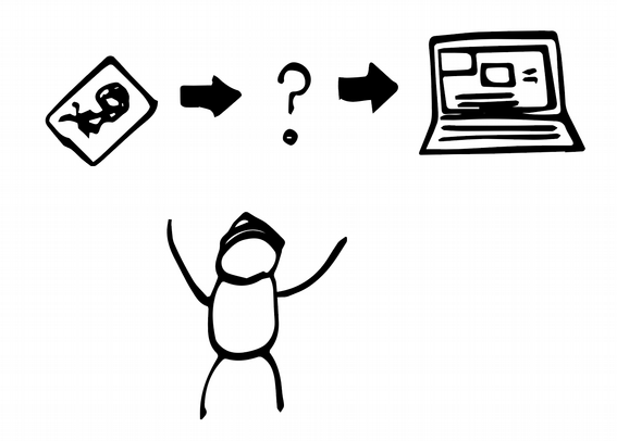
5. Stay enthusiastic. If you do not think your results are fun and interesting, chances are your audience won’t either. Try your very best to identify exactly what made you interested in this problem originally, and convey that to your audience. Sometimes that involves explaining how your results might be used in the future – I have sometimes taken the liberty to add slides that were just called “Imagine a thing that …” and used that to explain how my results could be transformed into systems that would change the world. Sometimes illustrated by less than perfect stick figure illustrations – but the point here is not to show off as a designer, but to show the audience that I really, really want to tell them how fantastic this system could be – even if I couldn’t draw it very well.
HOW TO PRESENT WITH POSTERS
The number one mistake academic posters make is cramming in too much information on a piece of paper. Depending on how your (published) paper is written, your poster often does not need more information than is in the conclusion section:
- What is the research question(s)?
- How have you engaged with your data (type of study, experiment, etc.)?
- What are your results?
- What are the implications of your results?
- Authors, affiliation, funding.
That’s it. Most of these should be explainable in 1-3 bullet points of one-two sentences each, not much more. If your poster is based on a paper, you can print out copies of the paper and keep those next to the poster, so that interested parties can grab one.
Layout
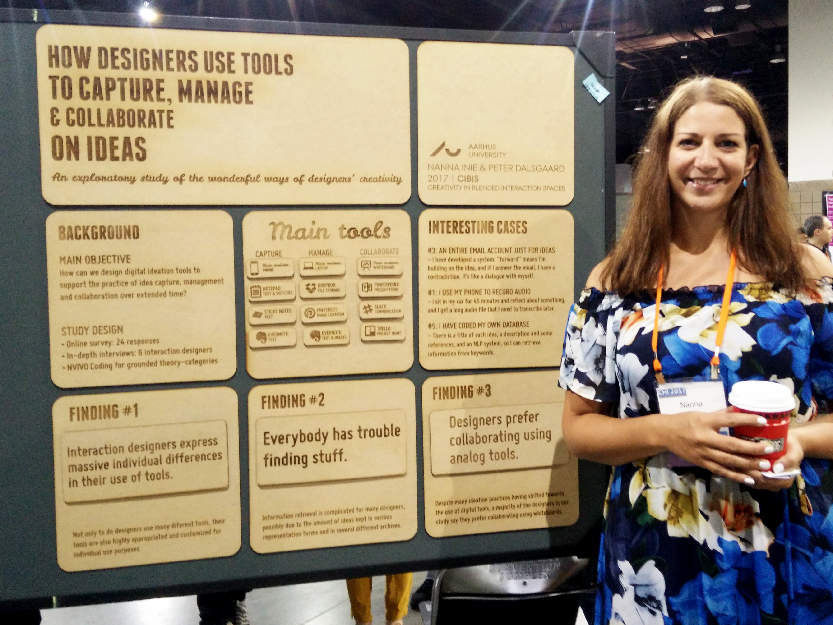
People from left to right language systems read from left to right and top to bottom, which is how you have to help them digest the information you would like to present. Clearly defined boxes makes it easier for the eye to navigate the poster, especially in a horizontal (landscape) layout. Boxes do not have to be defined by borders (in fact, if you do not know what you are doing, I highly advise against using borders), but can be created by background colors or even white space. When you design posters, white space or negative space should be your new best friend – at least 40% of the poster should be free of text. This will make the text that did make the cut come much more into focus.
Consider highlighting your most interesting points with a colored box and white text, as for the title and conclusion below (notice how the other text seems “boxed” by white space but without actually having borders):
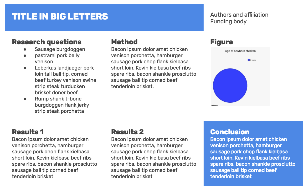 In my opinion, if you are not using a proper layout program (like Adobe InDesign), don’t be afraid of using tables to help you get that alignment right. It is much better to keep the layout conservative and maintain proper alignment than it is to experiment too much and end up with boxes that are a couple of centimeters off because PowerPoint just wants to watch the world burn. In the image above, I have just created one big table with three vertical columns, merged the two top left cells and, most importantly, adjusted the cell padding (the space, in pixels, between the cell wall and the cell content) to be high, thus automatically getting that nice white space.
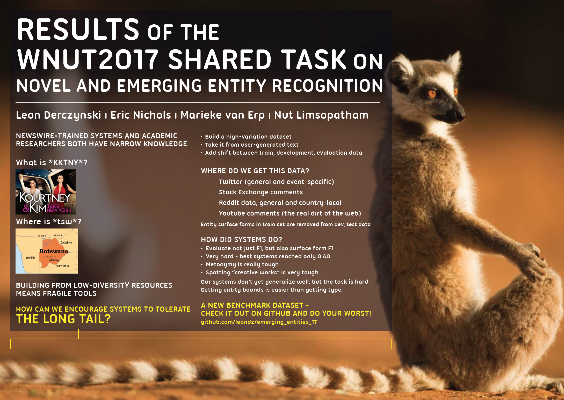
Finally, don’t underestimate the power of an attention-grabbing poster. In the poster below, the concept of “long tail” was translated into a lemur, giving an opportunity to use a really big picture of a cute animal. Cheap trick as it might be, it actually does attract people’s attention, and if you are hanging out by your poster for a couple of hours anyway, you might as well not do it alone.
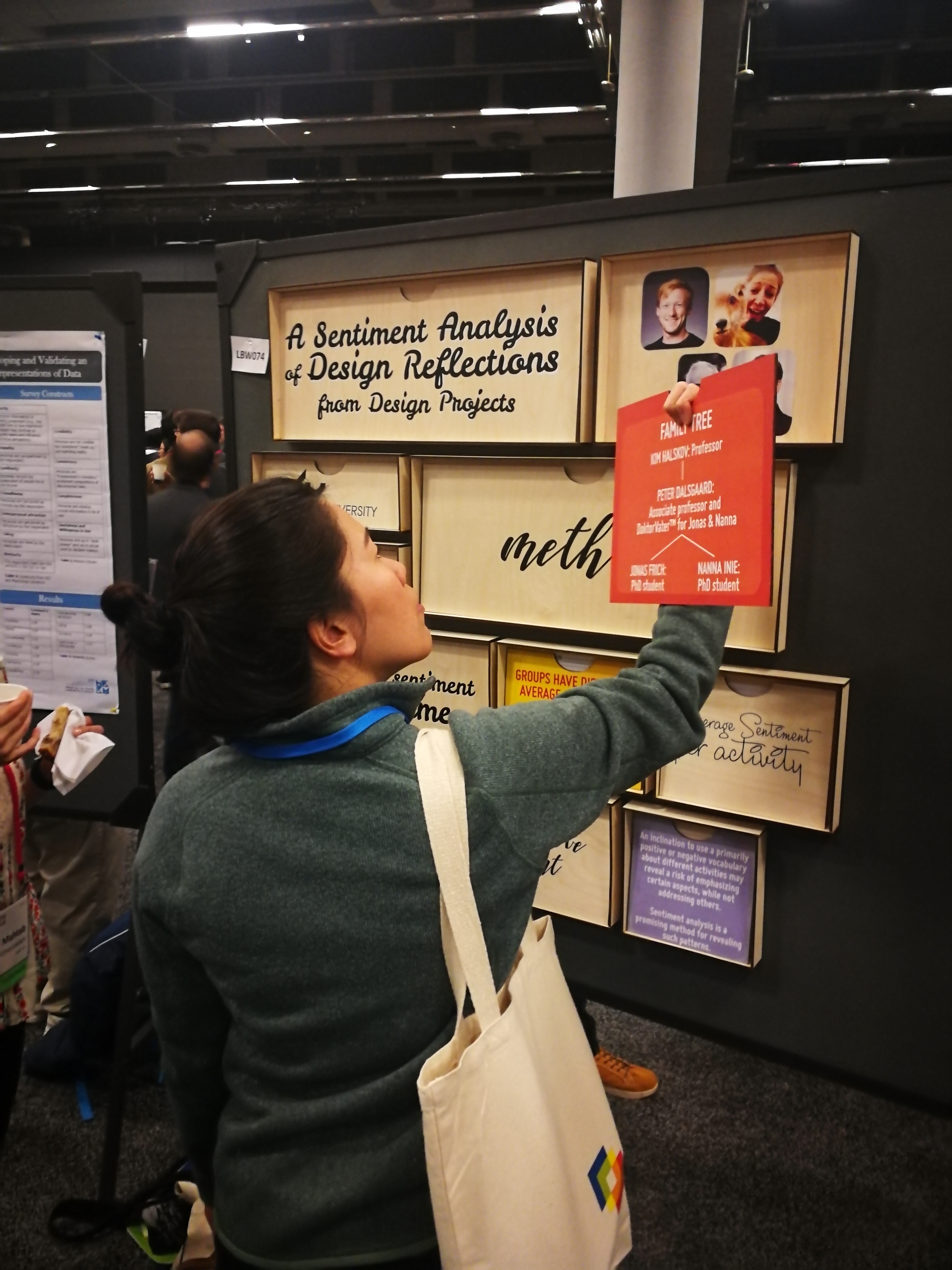
Other techniques can make a poster attractive. There two below are made of wood; the first is interactive, and one should turn round sections of it to reveal information. The second can be rearranged, connected with velcro – but the novel medium is enticing in itself.
Graphic resources
If you wish to upgrade the visuals of your poster, I highly recommend looking into three elements: images, icons, and fonts. I’ve added three resources for these that are free and easy to use:
Photos: https://www.pexels.com/
Gorgeous, free stock photos that will make your slides or posters so much more appealing
Icons: Looking for simpler illustrations? https://www.flaticon.com/categories is your friend!
Fonts: Sans-serif is generally better looking on screens and for headlines. https://www.fontsquirrel.com/ has many beautiful, free fonts – if you just need something that works quickly, you can’t go too wrong with Open Sans, Helvetica Neue or Rubik – bold for headlines and light or normal for body text.
Best of luck for your presentation!
 Nanna Inie is finishing up a PhD in Digital Design at Aarhus University. As well as being founder of the largest TEDx event in Denmark, Nanna has previously been acclaimed with audience favorite poster at CHI during a stay at the UCSD Design Lab, and owns a video production company.
Thanks. This is a timely blog, it arrives the same day I start preparing my poster.